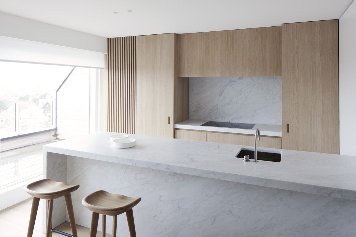
Design by: Rolies Architects
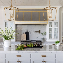
Design by: Meme – Design by: House of Jade Interiors
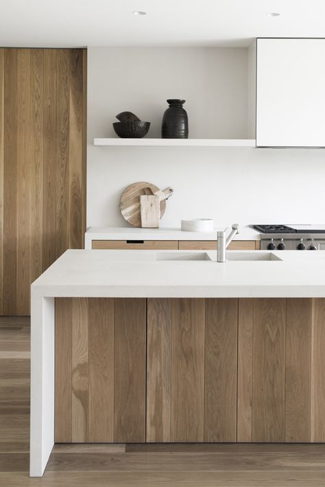
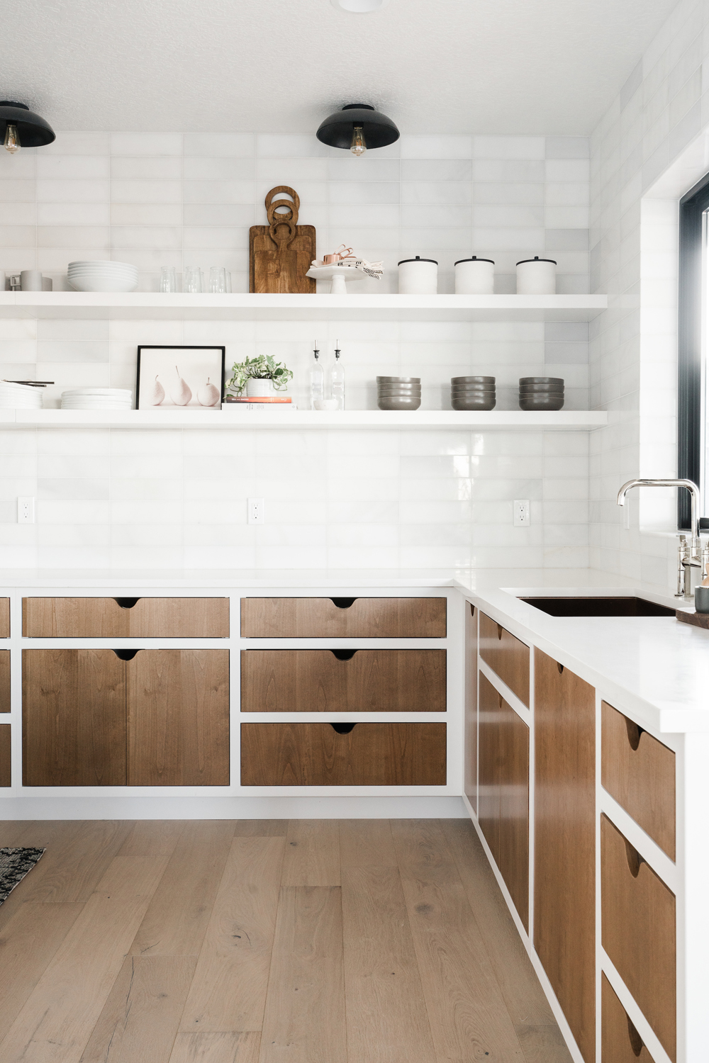
Vertical wood grains give a great contrast and texture. While trimming out the wood panels in a bright white can really make them standout.
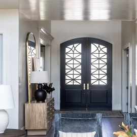
Design by: Cortney Bishop
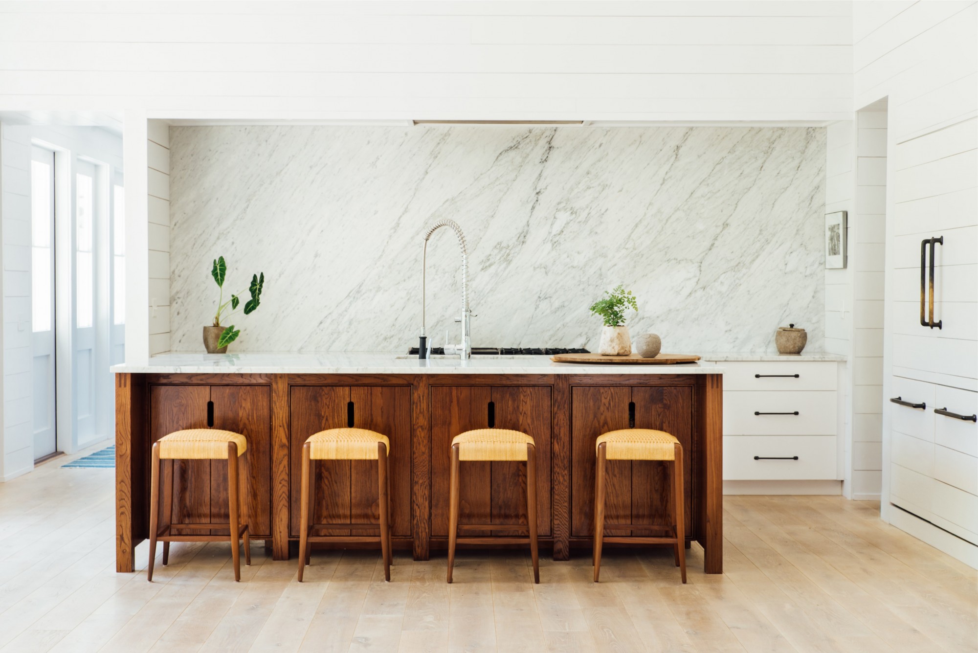
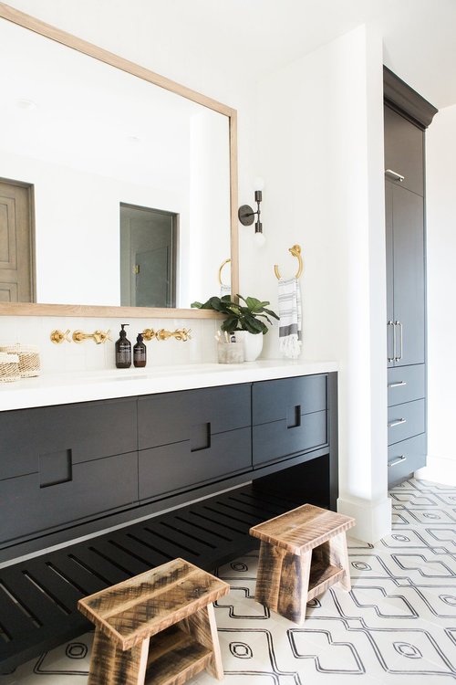
These dark wood panels have a lot of character and contrast so well with the simplicity of the flat white panels with a shiplap finish. And you can’t ignore the awesome dark pulls. Such a great combination.
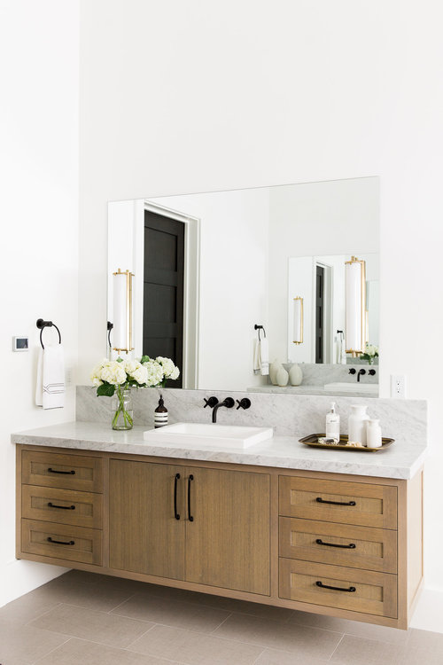
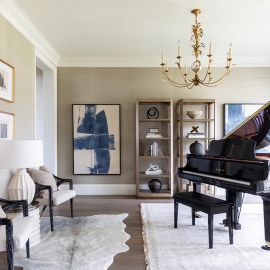
Design by: Meme – Design by: Studio Mcgee
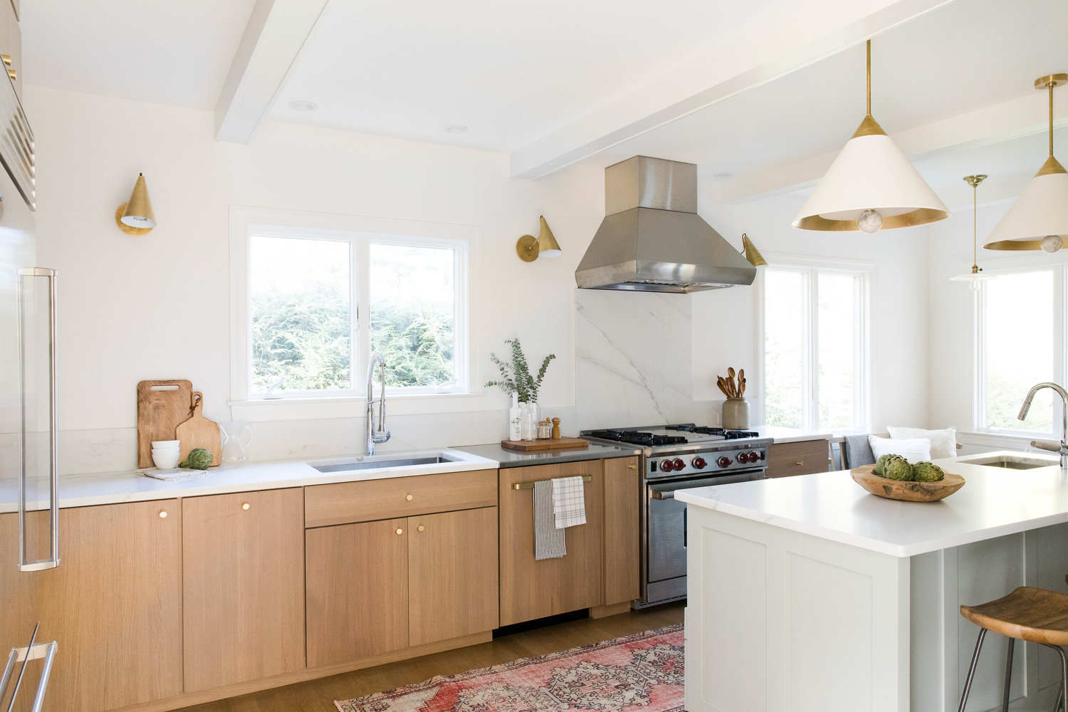
I realize there are a lot of wood cabinet images going on in this post, but that should tell you something. Wood cabinets are back. But don’t worry they are not your mom’s 80’s oak cabinets, these have their own new style. Their visual texture and color help to soften the feel of the sleek clean lines from flat panels. And if you want to warm up your space bringing in natural elements from the outdoors like these cabinets can definitely do that.
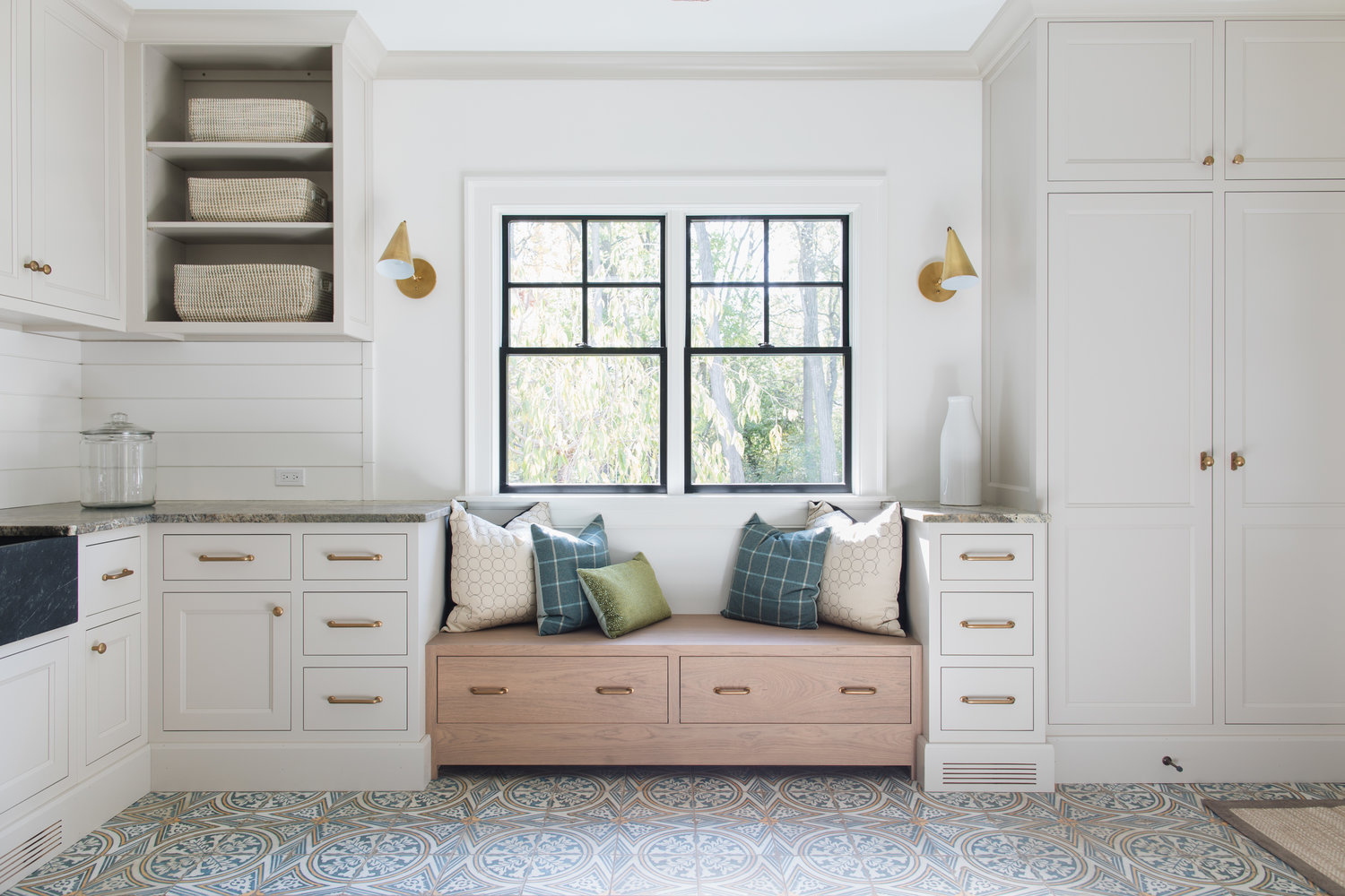
Design by: Jean Stoffer Design
This great design by Jean Stoffer seamlessly mixes three great trends going on right now. Painted cabinets, natural wood finished cabinets, and mixing flat and raised panels. This combination is one of my faves lately.
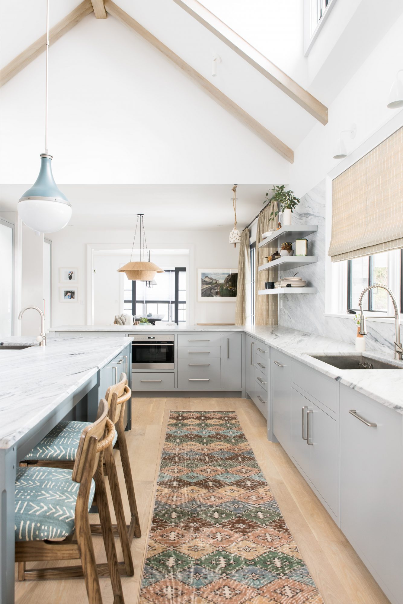
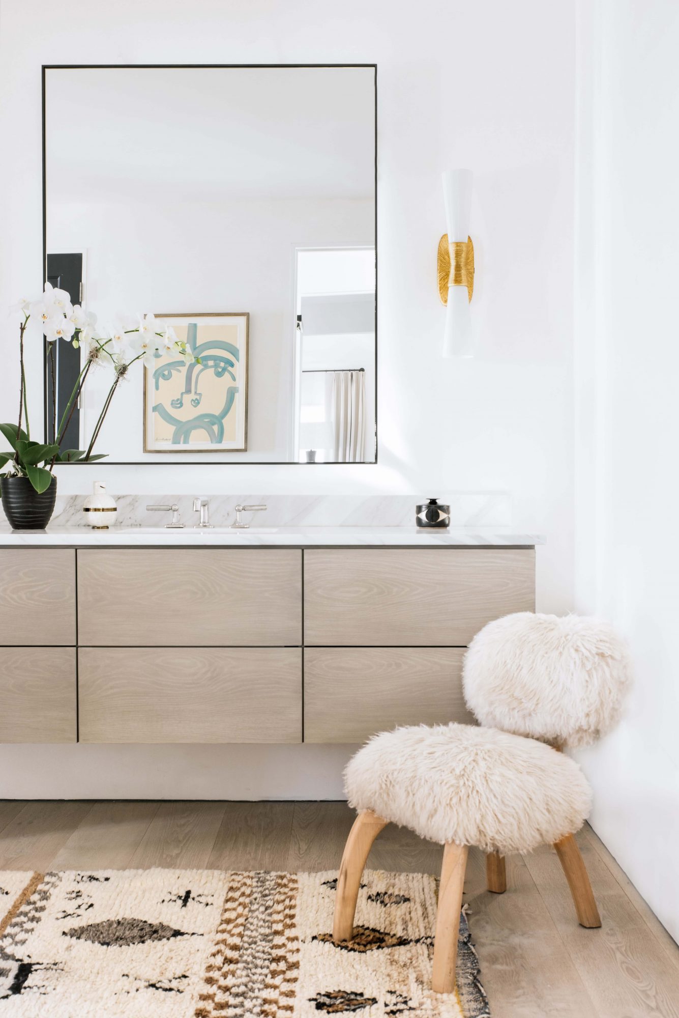
Design by: Cortney Bishop – Design by:Cortney Bishop
I have seen a lot of kitchens mixing white painted cabinets with a second painted cabinet color, but what I haven’t seen a lot of are people mixing colors with a similar tone in the same room, like shown here by Cortney Bishop. You may not catch it at first glance but the subtle look of this gray and soft teal combo is the perfect touch for this kitchen.
Design by: Cortney Bishop
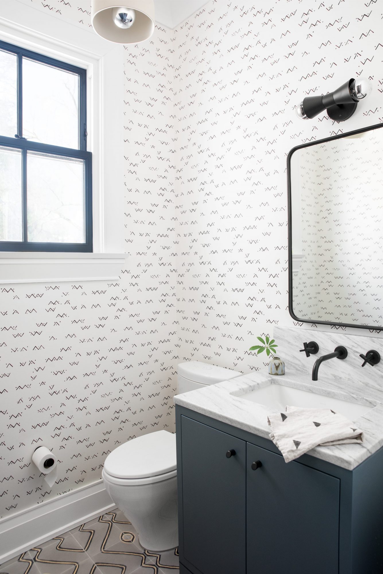
Things don’t need to be flashy to catch our eye. All of the simple clean lines in this room are what make it great, starting with the flat paneled cabinets and their sleek hardware.
Design by: Cortney Bishop – Design by: Studio Mcgee
Here are just a few more images of painted panels because they really are just that are great. Leave it to Studio McGee to step it up a notch by adding the square notched details instead of hardware giving it that extra something to stand out.
Design by: Rehabitat Interiors
Once again one of my favorite combos flat wood panels and raised painted panels. I also love the open feel given with no upper cabinets. It leaves room for those great sconces. Well done Rehabitat Interiors well done!
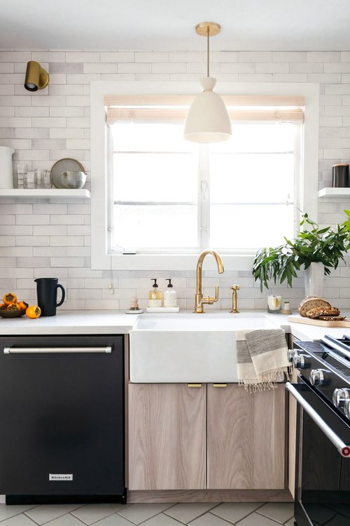
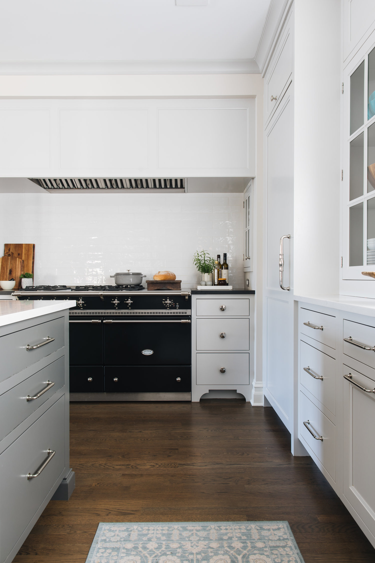
Design by: Studio Mcgee – Design by: Jean Stoffer Design
These two kitchens show how you can spice up your flat panels by adding some great pulls and knobs. Sometimes you just need the right accessory!
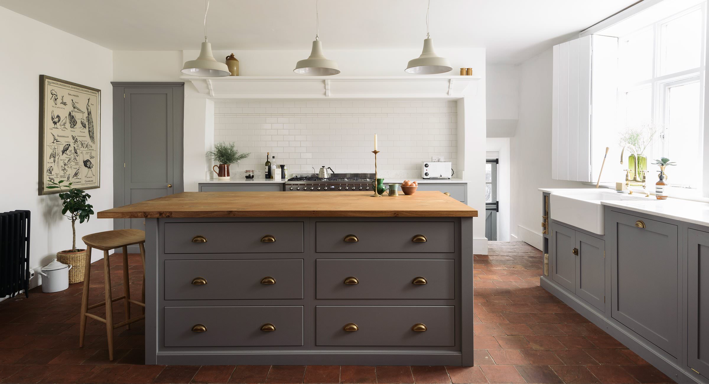
Design by: deVOL
If you are not familiar with deVOL you are missing out. They design some stunning classic English kitchens mixing wood tones, paints and different panel styles, like shown here. If you are interested in that look, check them out. They will give you some great inspiration and won’t disappoint.
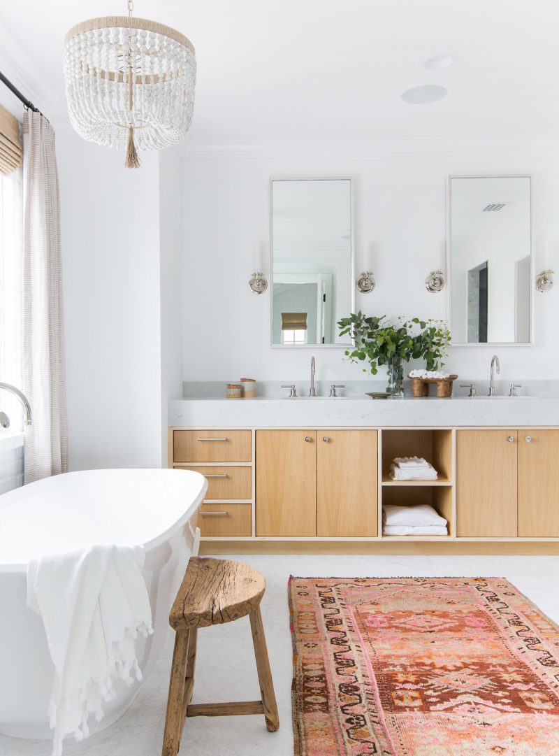
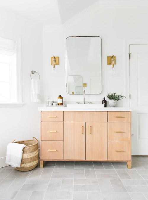
Design by: Amber Interiors – Design by: Studio McGee
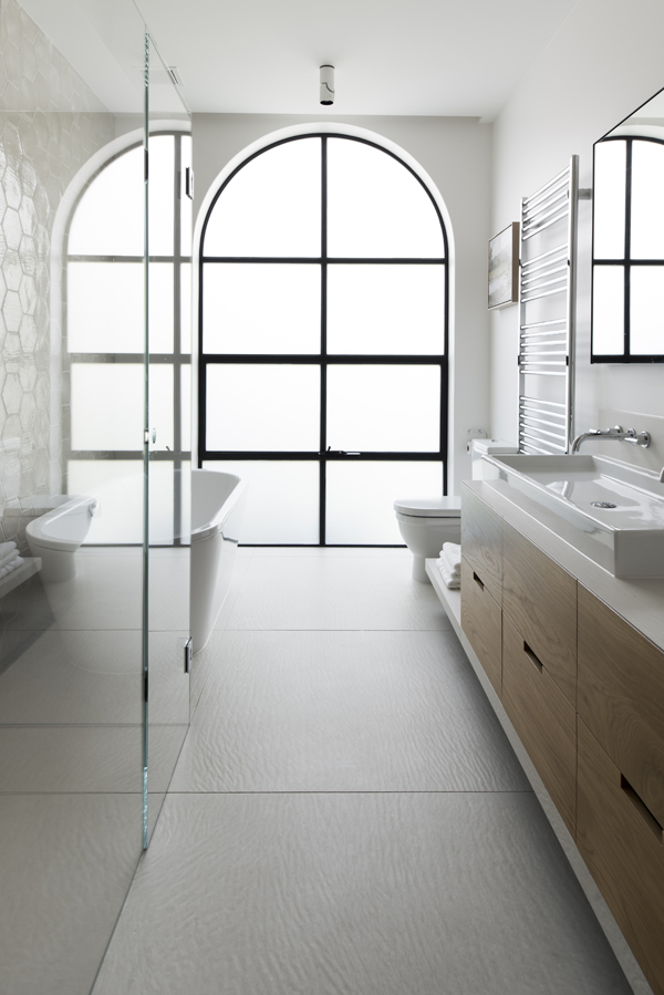
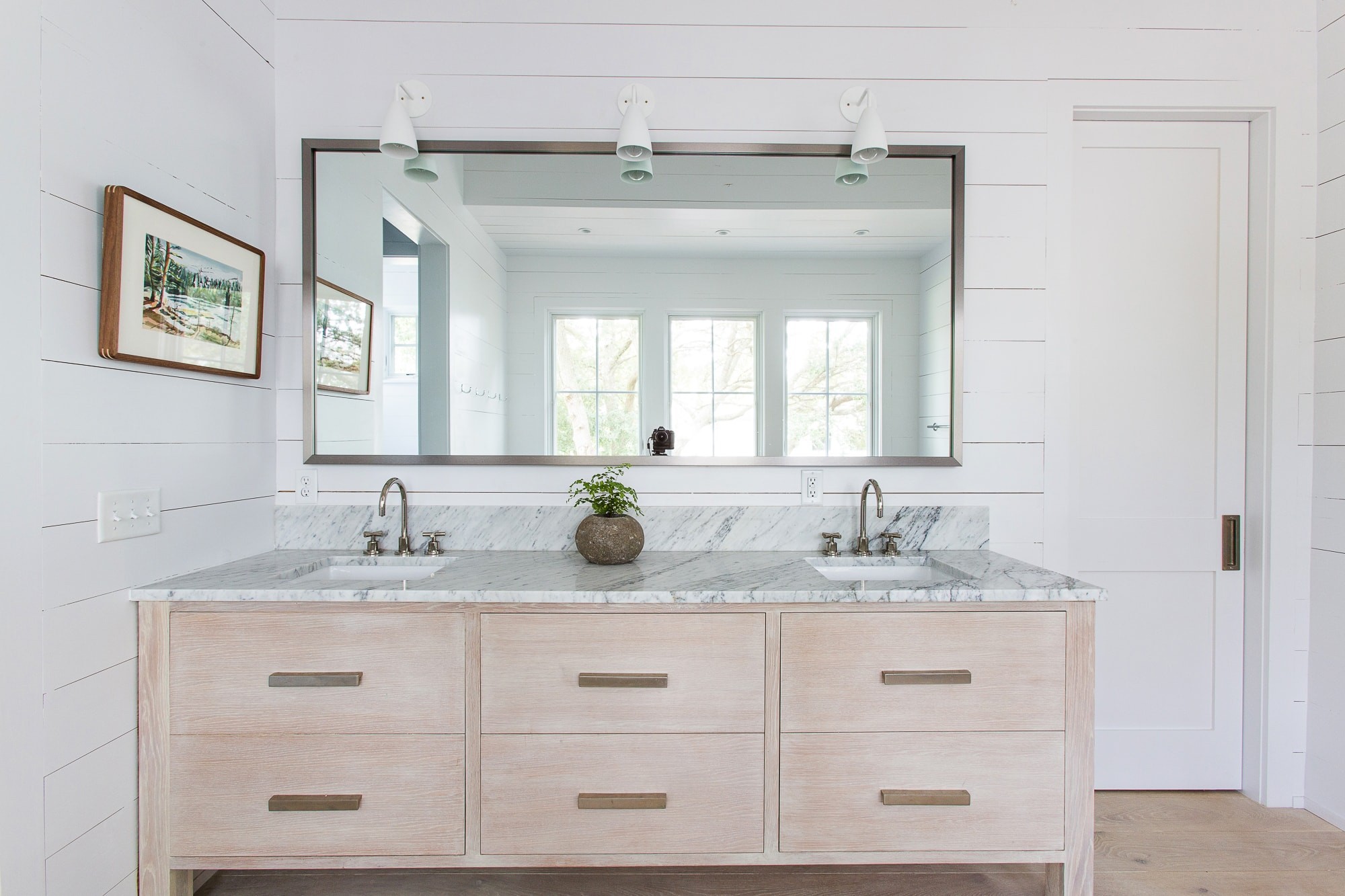
Two of my favorite design elements are wood tones and white. So mixing the wood panels against the white walls and stone countertops in these two bathrooms is a perfect combination.
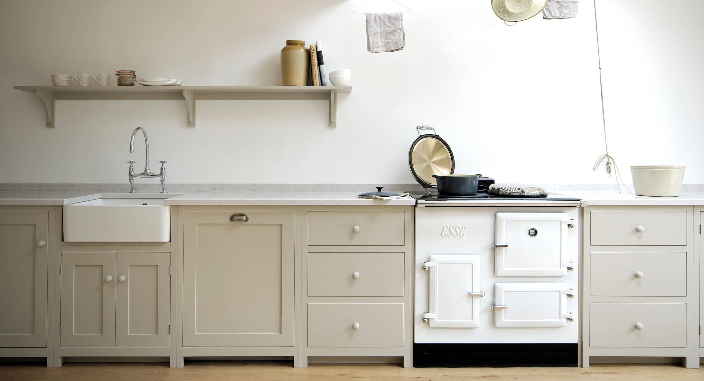
Design by: deVOL
I love the matching painted knobs in this kitchen. They add one more layer to the flat panels. Once again sometimes less is more.
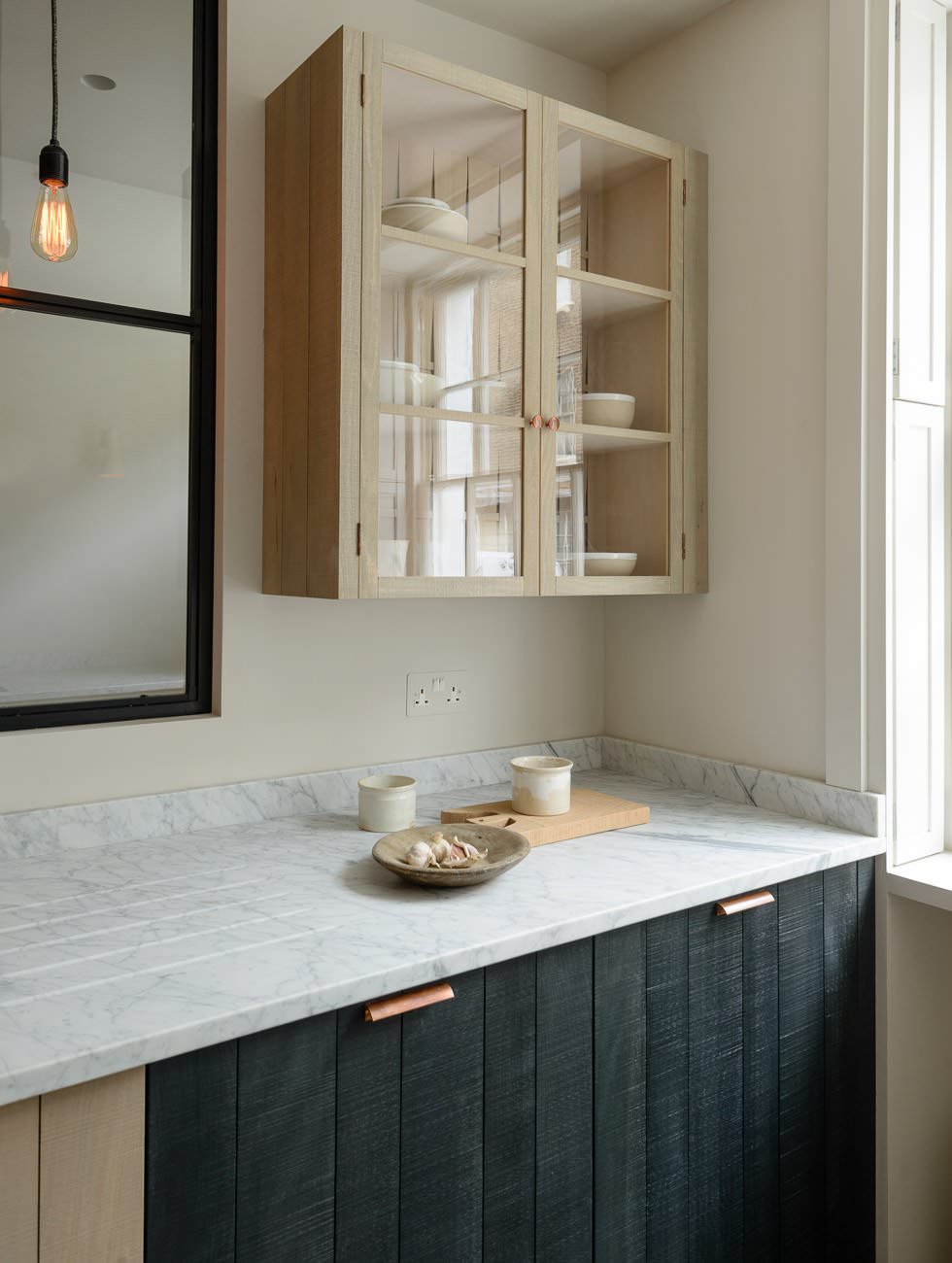
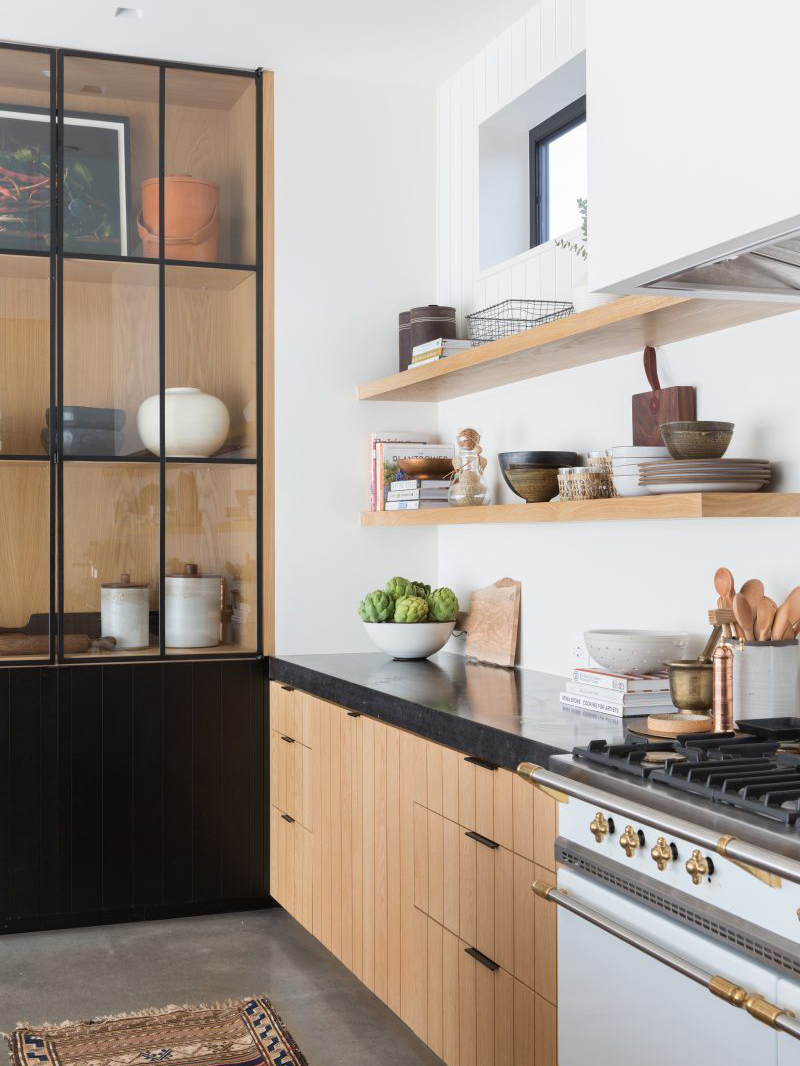
Design by: deVOL – Design by: Amber Interiors
There are so many amazing things happening in both of these kitchens. Up the game of your flat panels with this look. The vertical ribbed panels give just the right amount of edge and simplicity. Mixing the black finish with the natural wood gives these rooms a great blend of contrast and warmth. These designs are a great nod to the Scandinavian style I never tire of.
With so many options and combinations you can do with flat panels we are sure you can find and create a look you will love!

